MonsterDex
iOS App Design
March 2023 - May 2023
The MonsterDex iOS app project aimed to fill a significant gap in the PokéDex applications available on the Apple App Store. As a UI/UX Designer, my role was to create a user-friendly and visually appealing Pokédex app.
What I did
- UX Design
- UI Design
/Problem
The motivation behind embarking on this project originates from my frustration in searching for a reliable Pokedex app on my mobile device. Despite the abundance of options, each app presented issues such as outdated information, frequent crashes, unattractive user interfaces, and convoluted user flows.
This collective set of problems left a noticeable gap in the market for a comprehensive and user-friendly Pokedex application. This challenge resonates with fellow enthusiasts who, like myself, desire a seamless and efficient means to explore and catalog Pokemon information while on the go. It is this persistent issue that fueled my determination to create a Pokedex application, aiming not only to address these existing shortcomings but also to deliver an enhanced user experience, positioning it as the primary resource for Pokemon enthusiasts worldwide.
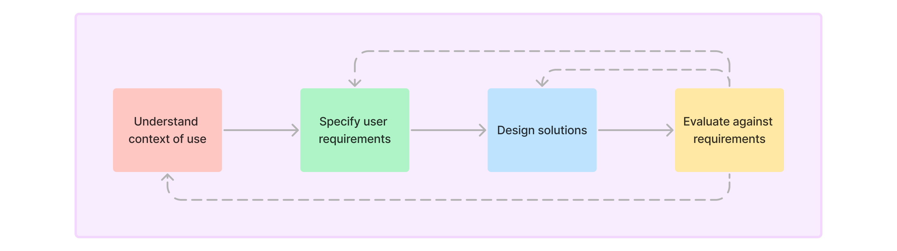
/Design Process
The design process for MonsterDex was a user-centered approach. I began by conducting user research to understand the needs and preferences of our target audience. This research informed the design of the app and ensured that it met the needs of our users at every stage of their interaction with the app.
Understand the Context of Use
I started by researching the context of use for our app. This helped me identify the user goals, motivations, and pain points.
I’m looking for a good Pokédex app for iPhone that has...description, Shiny, regional form, maps, Items, fight tools, and so on.
I'm looking for a Pokedex APP for Android [to help[] me through all the main games...tracking my caught list, building teams, and stuff like that.
I was mainly looking for one that had every Pokemon, the description of them, the games they can be caught in, their evolutionary path, and what their shiny version is.
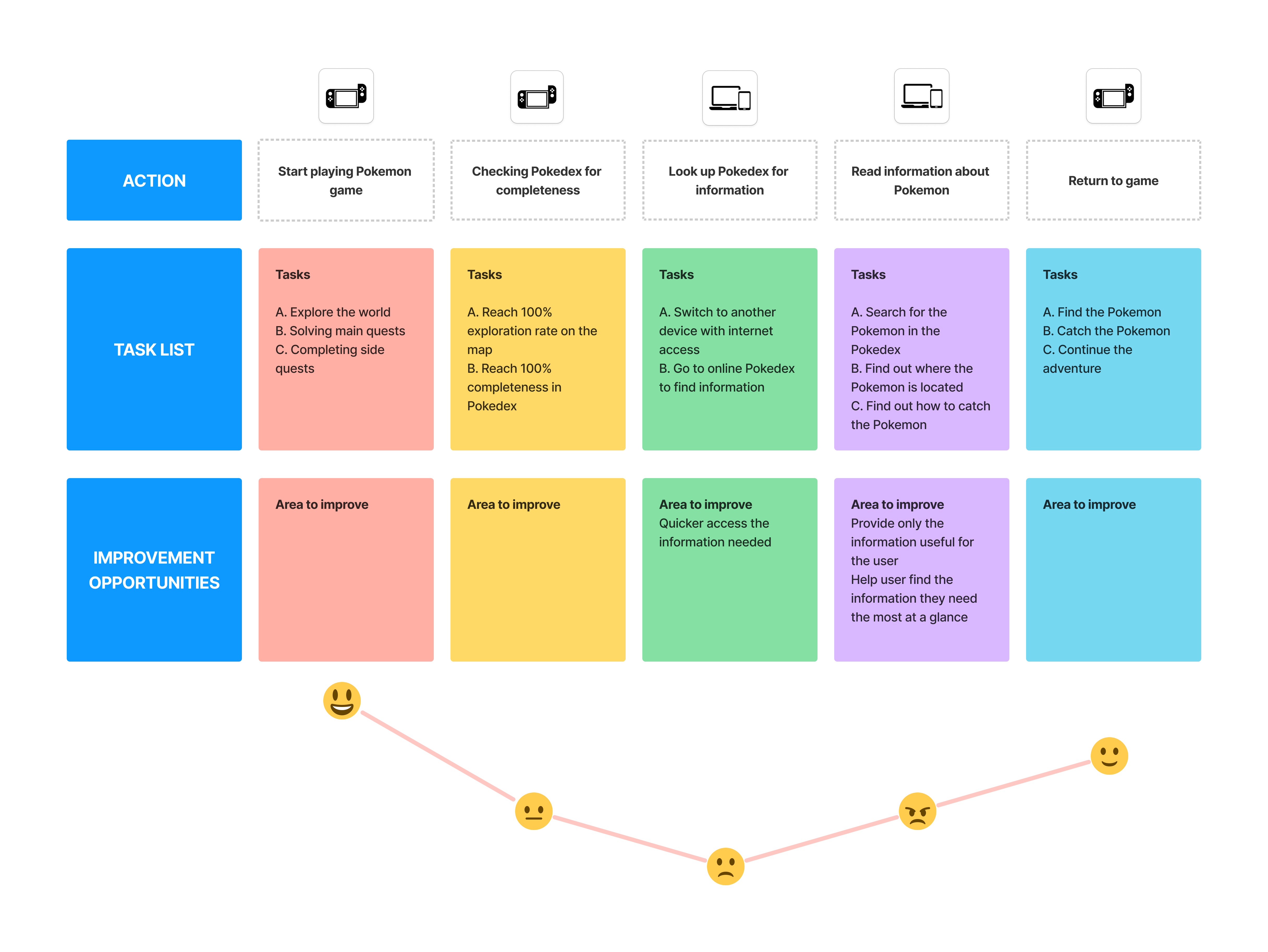
User Journey Map
I started by exploring the user journey to understand the user interaction from playing the game, to identifying missing information, searching for specific Pokémon, understanding the information, and then returning to the game. This helped me to identify the key touchpoints and pain points in the user journey. I used this information to inform the design of the app and ensure that it met the needs of our users at every stage of their interaction with the app.
Competitor Analysis
I evaluated the user experiences of competitors' products to identify strengths, weaknesses, and opportunities. I analyzed competitor features, design choices, and overall strategies.
The most common issues I found include outdated information, frequent crashes, unattractive user interfaces, poor information architecture, and convoluted user flows. These problems created a demand for a more reliable and aesthetically pleasing Pokédex app.
The poor information architecture in these apps often led to a frustrating user experience. Users found it difficult to locate the specific information they needed, such as detailed Pokémon statistics, evolutions, and move sets. The lack of a coherent structure within the apps meant that players had to spend an inordinate amount of time navigating through cluttered menus and confusing categories. This not only hampered their gameplay but also made the overall experience less enjoyable.
Moreover, the convoluted user flows in these existing Pokédex apps exacerbated the problem. Simple tasks like searching for a Pokémon, viewing its abilities, or accessing its location in the game world became time-consuming and counterintuitive. Players often found themselves lost in a maze of menus, and the lack of a logical progression in their interactions with the app made it challenging to achieve their objectives efficiently.
User Archetypes
I created user archetypes to help me understand the needs and motivations of our target audience. This allowed me to identify the key features and functionalities that would be most valuable to our users. Based on the competitor research, I identified two distinct user categories:
Casual Player
These users seek basic information, including:
- View Pokémon by type or generation
- Finding the location of specific Pokémon
- Understanding how and when a Pokémon evolves
Hardcore Player
These dedicated players aspire to excel in their Pokémon journey by accessing information such as:
- Tracking their PokéDex collection progress in their current game
- Utilizing a team builder tool to assemble the most effective team
- Gaining insights into hatching mechanics
Specify User Requirements
I identified the key features and functionalities that would be most valuable to our users. This allowed me to prioritize the development of features that would have the greatest impact on the user experience. A list of user requirements was created to guide the development of the app. These requirements were based on the needs and preferences of our target audience and were used to inform the design of the app.
The user requirements were organized into two categories: essential and desirable. Essential requirements were features that were critical to the app's functionality and were necessary for the app to be successful. Desirable requirements were features that would enhance the user experience but were not essential for the app to function.
A list of essential requirements is as follows:
- Ability to view Pokémon description
- Intuitive search functionality
- Information on Pokémon abilities and evolution paths
- Team builder tool
- Location of Pokémon in the game world
- Information on Items, Moves, Natures and Abilities
- Shiny Pokémon information
- Generations information
- Personalized caught list
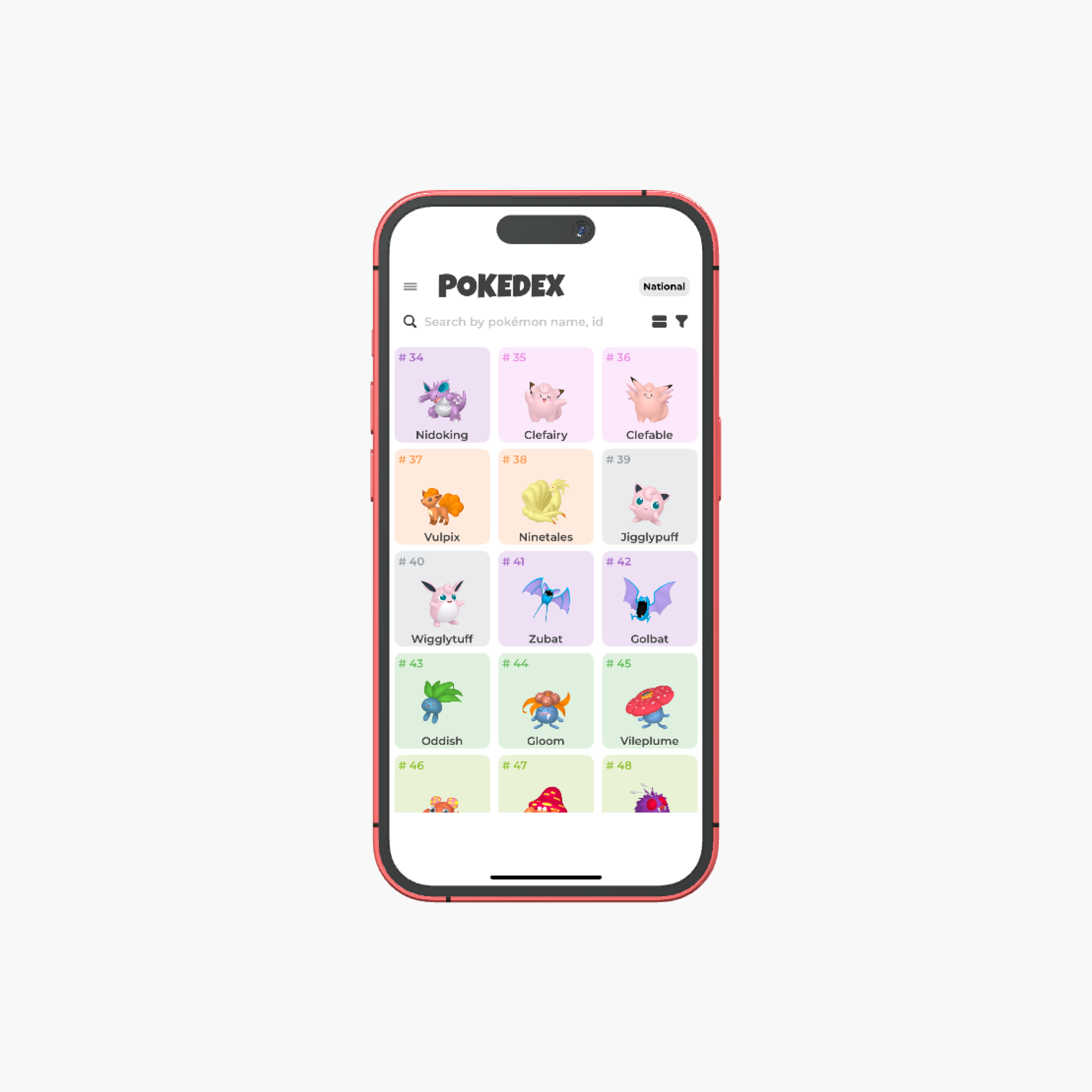
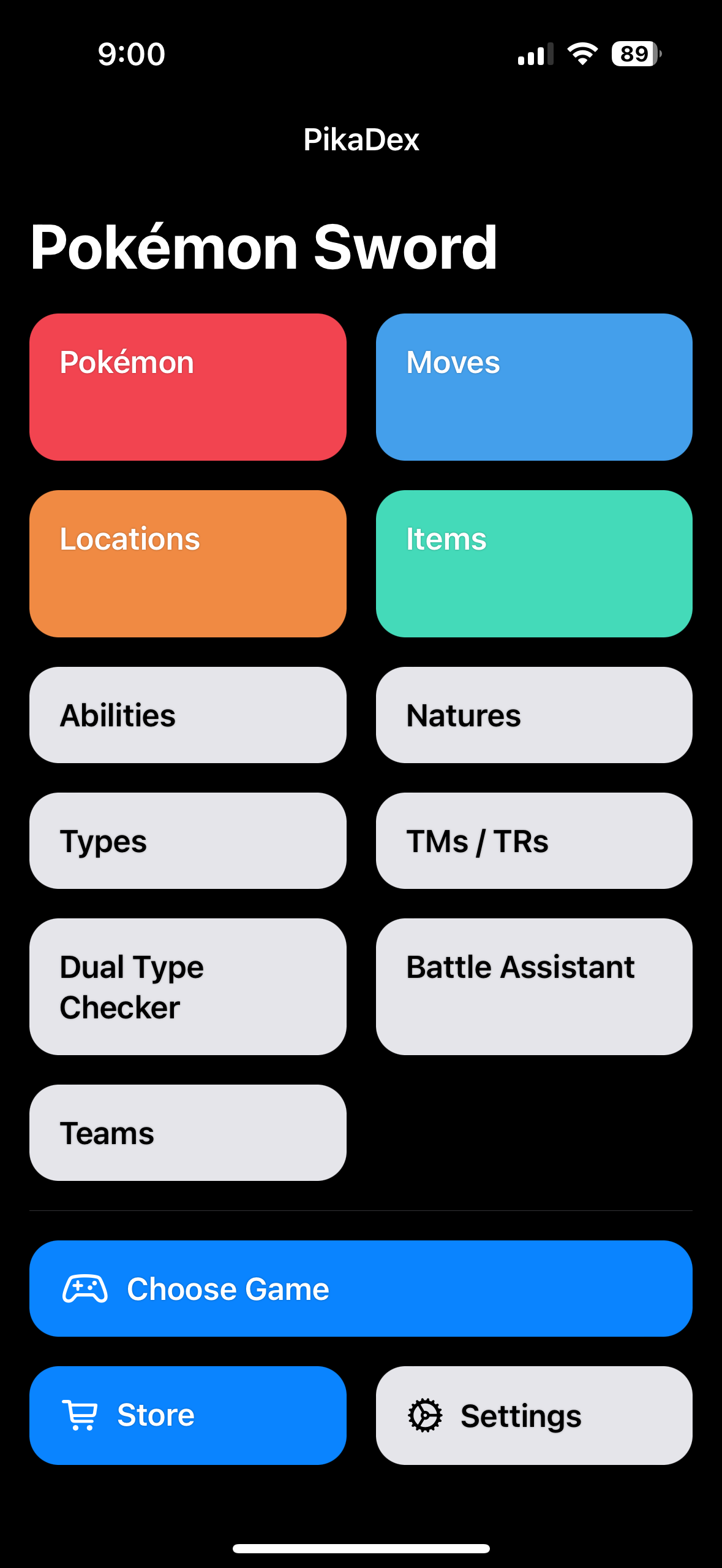
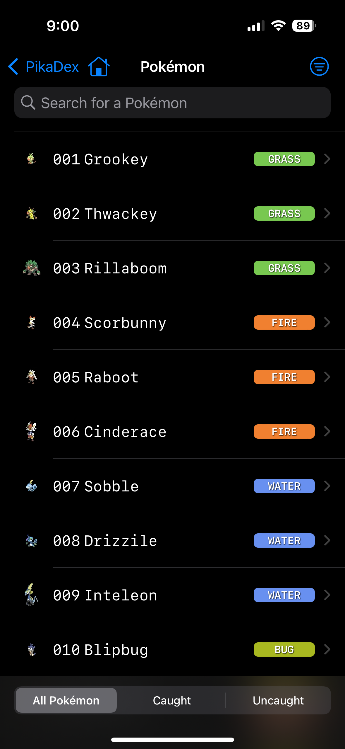
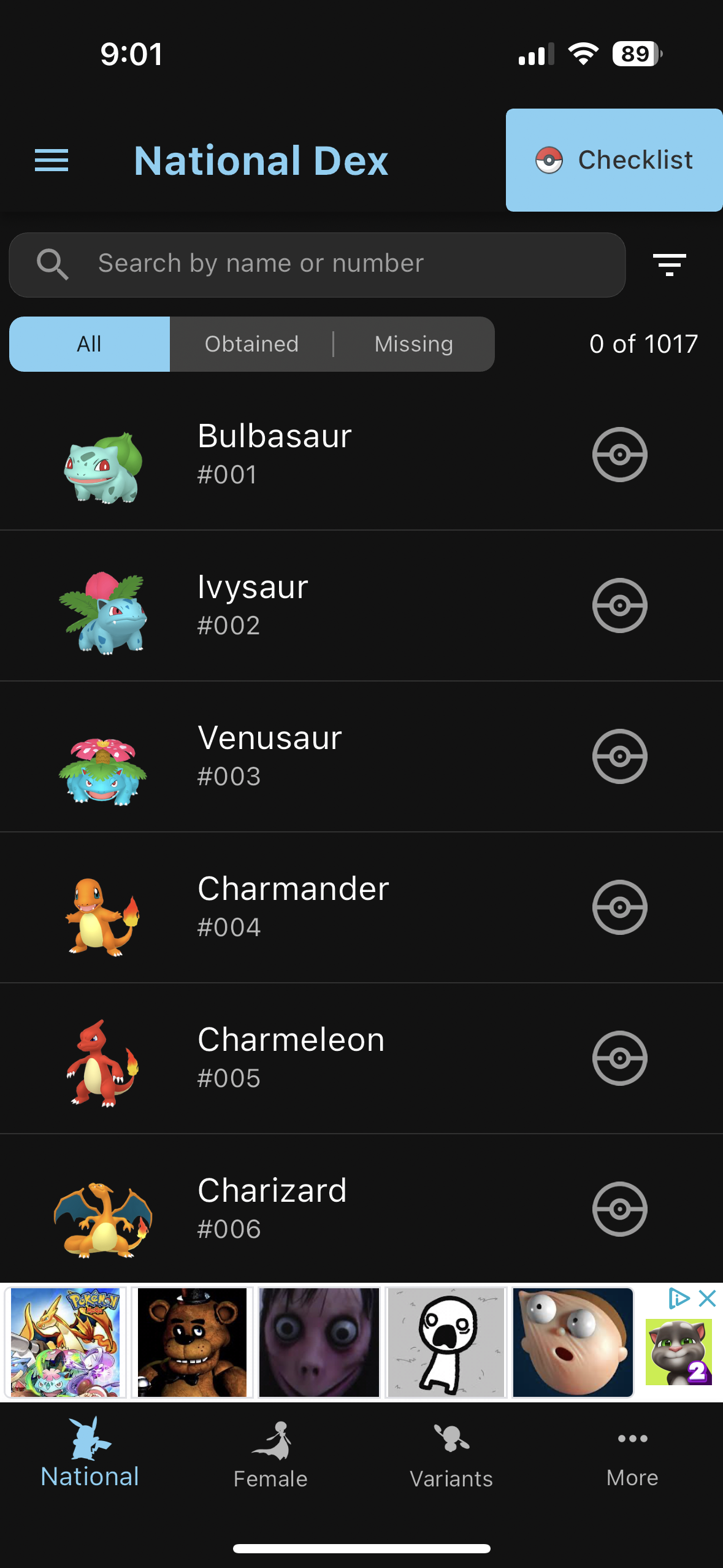
Design Solutions
Information Architecture
To design an effective information architecture (IA) for our product, I aligned our design decisions with the needs and expectations of our users. I meticulously organized the collected data to inform the development of our IA framework.
To accommodate the needs of both casual and hardcore players, I categorized the app by type. This structure allowed users to easily access the information they needed, whether they were looking for basic Pokémon data or information about a specific ability.
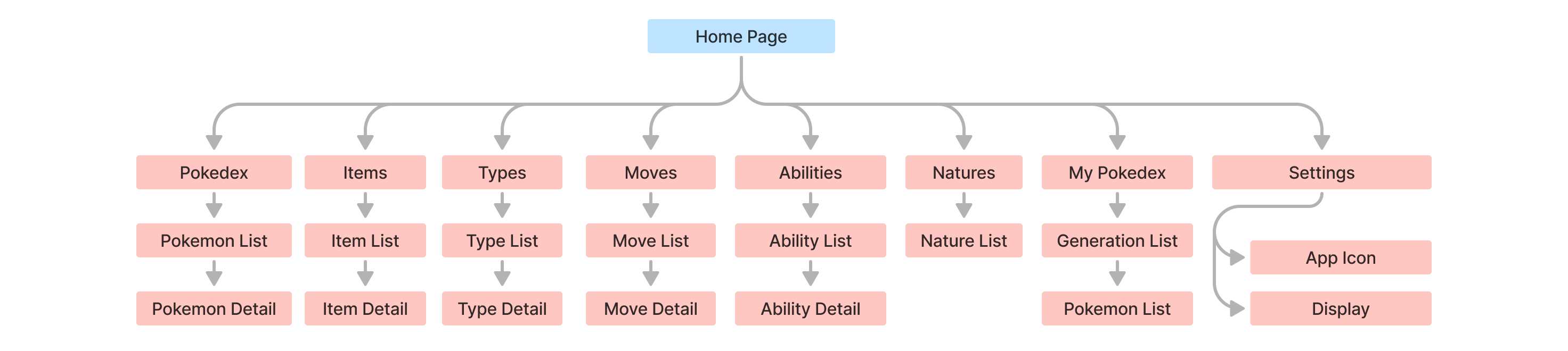
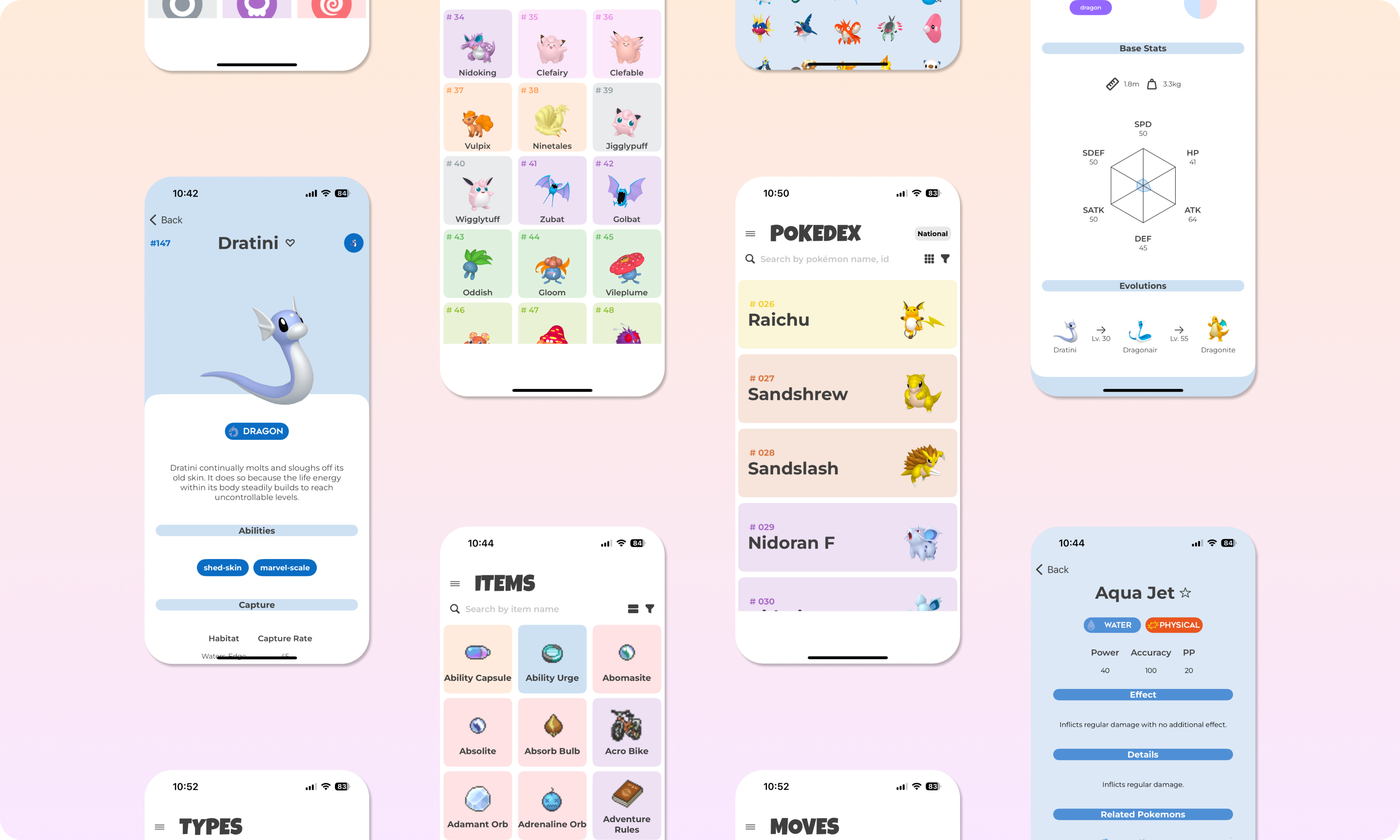
Wireframing
After carefully considering the needs of our users, I created a set of wireframes to visualize the app's layout and functionality. These wireframes served as a blueprint for the app's design and helped us to identify potential issues early in the design process.
The use of a hamburger menu allowed us to maintain a clean and uncluttered interface, while still providing access to all of the app's features. A search function was also included to allow users to quickly find the information they needed.
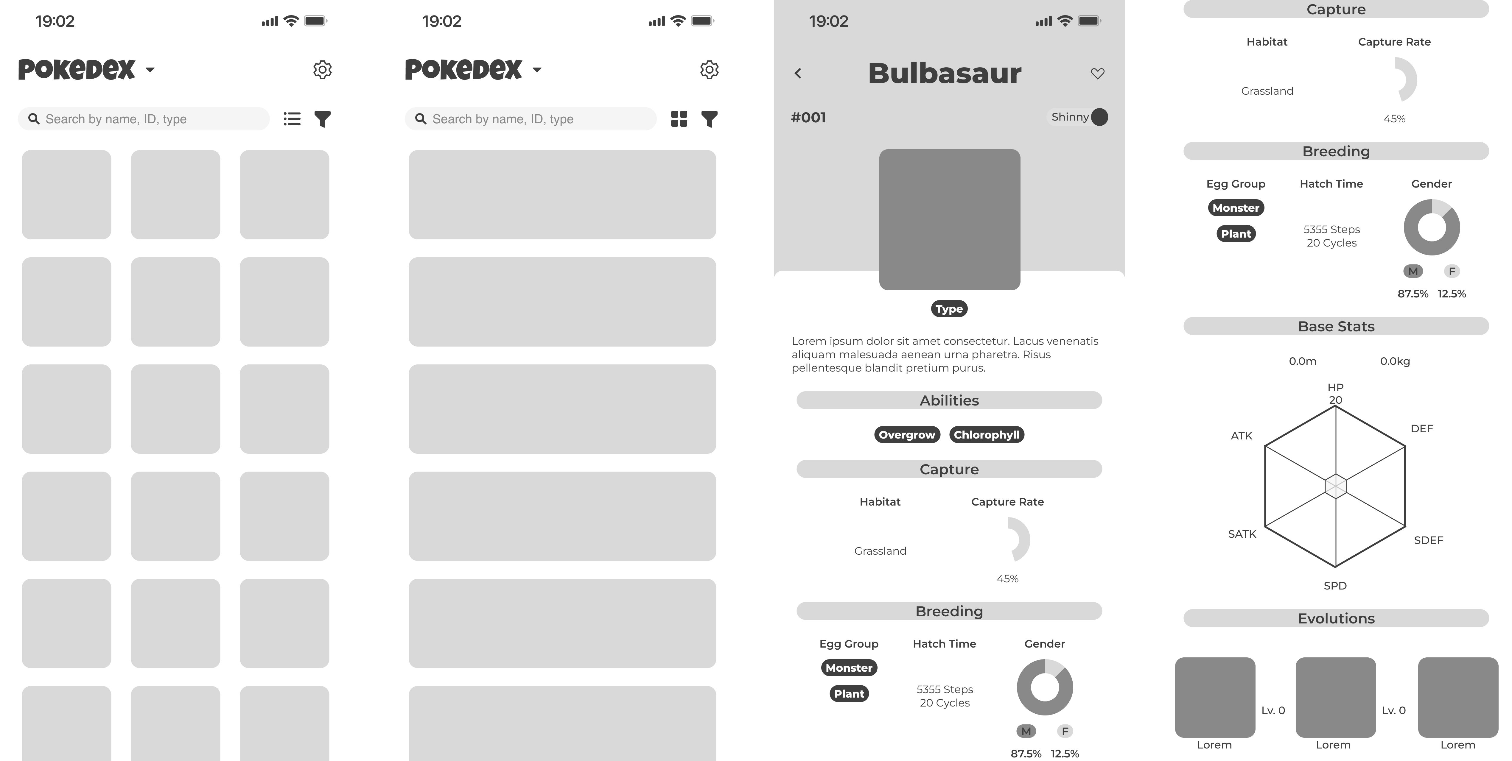
/Mock-up
/Challenges
A significant challenge during the project was aligning our design vision with the technical feasibility. Open and honest communication between the UI/UX Designer (myself) and the iOS Developer was essential in finding common ground. We resolved this by prioritizing features based on user needs and technical constraints.
It is important to note that the app's design decisions were heavily influenced by the technical constraints of the iOS platform and the capability of the developer. This required a high level of collaboration and communication with the Developer to ensure that the final product was both visually appealing and technically feasible.
/Lessons Learned
In leading UX/UI design for our iOS app using Figma, I gained key insights that shaped my approach:
- Team Collaboration: Worked closely with a partner, leveraging strengths for a cohesive app. Emphasized open communication for aligning creative visions.
- User-Centered Design: Prioritized user research, wireframes, and prototyping for iterative improvements. Resulted in a refined design based on valuable user feedback.
- Attention to Detail: Emphasized meticulous refinement and adherence to design guidelines for consistent and intuitive visual elements. Contributed to a seamless and delightful user experience.
/Future Directions
In our ongoing efforts to ensure the sustainability and continuous improvement of the app, we are planning a strategic implementation of the following features:
-
Non-Intrusive Ads:
- Strategic implementation for sustainability.
- Prioritize seamless user experience.
- Balance functionality and advertising for financial viability.
-
User Engagement:
- Deep commitment to user feedback.
- MonsterDex community.
- Actively listen and collaborate based on evolving user expectations.
-
Team-Building Feature:
- In-depth stat comparisons, personalized move set recommendations, and advanced synergy analysis.
- Provide users with a robust toolkit for crafting ideal Pokémon squads.